
We are up to 3,000 flag entries now and as I peruse them it is evident that the strongest preference is to design a flag that incorporates the existing and the Maori flag as well as the silver fern. That is encouraging and confirms that entrants see an evolutionary rather than a revolutionary approach as being preferable and that the key change is to drop the Union Jack and to incorporate the relevance of both treaty partners to contemporary New Zealand’s constitution and values.
Entries close on July 16th so it would be great to see more efforts out there that try to perfect the key elements we need in a flag that speaks for us, the New Zealanders.
Personally, I prefer a flag that contains the following elements
- An evolution from the current flag, rather than a revolution – this respects the affinity people have for the current flag, notwithstanding what it stands for. Familiarity with a flag that has existed our whole lives and that we’ve been brought up to respect – is the reality, and short of opting for a totally new symbol with no links to the past
- Respect of both the national flag and the Maori flag – both official symbols
- An attempt to ensure all ethnicities in contemporary NZ can see they are represented in the flag – not just the two original signatories to the treaty, but all of us who are New Zealand citizens
Given these desirable elements I find it difficult to find the appeal of a flag that
- doesn’t have red, white and blue as well as red and black – the base colours of the two current official flags
- doesn’t contain the Southern Cross, as it is represented on the fly of our current flag and is generally agreed as the ‘guiding stars’ for all of those who travel to New Zealand
- doesn’t incorporate the koru design of the tino rangatiratanga flag which recognises the original inhabitants and the right for their society and culture to thrive
- includes the Union Jack – not because I’m in denial of the role the British have played in establishing New Zealand post 1840, but rather because the unfortunate practice of colonisation was an horrendous betrayal of Maori that has cost their society dearly. Thankfully, 135 years on from that fateful period New Zealanders of all kinds came together to try and put things right, and form the foundation for a New Zealand that can now go forward on the basis of an honest acknowledgement that it is the treaty rather than a British Governor’s unilateral declaration of colonisation, that makes provides our rights of citizenship.
Given these essential elements I find flags that bring in new colours, or that have new symbols or have stories behind them that don’t respect or promote the bicultural arrangements of our multicultural society – challenging. To exclude any one of the 3 key elements would be inappropriate and rather than do that I suggest a flag that is totally new, with no links to the past, would be less controversial. But I’m optimistic that we can get a design that really emphasises the history and the values of being a New Zealander.
With those provisos in mind, and having looked at all 3,000 submissions to date, the following 10 designs – and just as importantly their stories – make the cut for me, in terms of getting to Referendum 1. Not all of them manage to cover the 3 key elements listed above, but with a bit more work they could – making for a flag with a strong and accurate underlying story which for me is the first step to getting the design right.
Te Waka
Trevor has got the multicultural representation sussed, and also includes the Maori heritage to augment the red, white & blue Southern Cross which represents the original settler arrivals as well as providing continuity from our current flag. I like his description of why he’s used green but I would have liked to see the tino rangatiratanga flag more fully represented.
[box]Te Waka
Designed by: Trevor Andrews from Otago
Suggested by: Trevor Andrews from Otago
 Kia ora tatou – We are a proud independent Pacific nation made up of many nationalities and ethnicities, but we must remember our tangata whenua considering our past and future. The stylised koru that make up the silver fern are symbolic of our Maori whakapapa and heritage and the many new and differing ethnic “strands” that now make up AotearoaNZ. The silver fern is unfurling from the ground and is representative of our flora and fauna but also represents Maui fishing our islands out of the sea. The four stars are the “heavenly” Southern Cross by which we as NZ’s navigate to and from our land and sits in the “tapu” quadrant of the flag design. The blue represents our seas and skies and the green represents our bush, pastures, farms and quarter acre dreams. The top of the silver fern is a symbolic “prow” of a waka taking us all to into the future. The blue and red are acknowledgement of our colonial past and the green symbolises our forefathers efforts to carve out new lives in these Islands. The curving of the silver fern follows the form of the many mountains, rivers and streams of Aotearoa NZ.
[/box]
[hr]
Silver Fern Flag
This is the Kyle Lockwood original. He has been the most prolific submitter of designs with submissions by Kyle or based on variations of his submissions numbering 180 at last count. Overall they cover the red, white and blue, the red and black and enrol the silver fern, the southern cross, the kiwi, the koru, the coat of arms. Kyle’s original design – which was the winner of a number of flag designs in the past – I find too monocultural with no recognition of the treaty or Maori. It does remove the Union Jack and hence provides a good base for a design that reflects New Zealander’s own identity. And its silver fern is the most recognized style of that symbol. But for me it needs to more strongly assert our bicultural foundation. Some of the 180 variations of his original get there on that score.
[box]
Silver Fern Flag – Kyle Lockwood’s Original
Designed by: Kyle Lockwood from Wellington
Suggested by: silverfernflag.org from Wellington
 Silver Fern A New Zealand icon for over 160 years, worn proudly by many generations of New Zealanders, from sports people, to military personnel and fire-fighters. The silver fern is an element of indigenous flora representing the growth of our nation. The multiple points of the fern leaf represent Aotearoa’s peaceful multicultural society, a single fern leaf spreading upwards represents that we are all New Zealanders – one people – growing onward into the future. Southern Cross Represents our geographic location in the antipodes. The Southern Cross is visible throughout the year in the southern night skies. It has been used as a navigational aid for centuries and it helped guide early settlers to our islands. Each star is also representative of the major island groups of NZ- North Island, South Island, Stewart Island, and the Chatham Islands. Red is a prestigious colour to Māori, Red also represents the sacrifice made by all New Zealanders during wartime. Blue represents our clear atmosphere, and the Pacific Ocean, over which all New Zealanders, or their ancestors, crossed to get to NZ. White represents Aotearoa, ‘Land of the Long White Cloud’, the Māori name for NZ. The colour white also represents peace.
[/box]
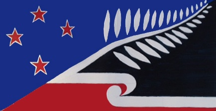
One Land: Many People
Timo has the multicultural nature of NZ sussed and has used the Silver Fern to bind the red white & blue Southern Cross and the Tino Rangatiratanga flags together so I find his design very appealing
[box]
One Land : Many People
Designed by: Timo Rannali from Bay of PlentySuggested by:
Suggested by: Timo Rannali from Bay of Plenty
 This design unifies our people telling the story of our nation: past and future. Divided into 3 sections: 1) Top left blue section. The 4 stars locate us geographically under the Southern Cross. The stars remind us that all first settlers navigated their way here (Maori and European). It also represents our European heritage, borrowing the colours and stars from our existing flag. 2) Bottom right based on Tino Rangatiratanga (designed by Hiraina Marsden, Jan Dobson, Linda Munn) reminds us of our Maori heritage. It comments on our nations` journey (past and future) through the Treaty of Waitangi. 3) The diagonal Silver Fern: a quasi-national emblem. The unifying element in the design; the glue between our past and the hope for the future. Each finger on the frond represents different people groups that inhabit New Zealand. They are united and held together by the stem. The arrow-like fern points upwards and forwards signifying our journey from strength to strength. If the blue section is like the sky (Ranginui) and the bottom right like the earth (Papatuanuku) , then the fern that dissects the sky and the earth becomes a symbol of ‘The Long White Cloud’ stretching across AOTEAROA.
[/box]
[hr]
Identity New Zealand Flag Design, 1st Variation
Apart from not yet having a suitable name I find Mike’s design a strong blend of our two official flags that gives a pictorial representation of our bicultural nature. Missing for me though is the multicultural aspect of New Zealand which is incredibly important to represent. We have already had a flag that has provided only one group’s perspective – that of the British Settlers. We don’t want a flag that is in denial about our multicultural identity and the Silver Fern is a great way to embody that.
[box]
Identity New Zealand Flag Design, 1st Variation
Designed by: Mike Murphy from Gisborne
 The traditional colours remain to carry the modern kiwiana cultural identity. Though the Union Jack is removed to represent our individual and independent identity as a nation, the colours remain as an acknowledgment as part of the commonwealth. A design visually based on the Tino Rangatiratanga Maori flag has been added which recognises the indigenous cultural heritage of the nation; the korus represent the land of the long white cloud, and by representing greetings of the handshake and the hongi, the design represents the manaakitanga, the friendliness, and the hospitable nature of New Zealanders towards our visitors and the multicultural society we now live in.
[/box]
[hr]
Aotearoa
Trent has blended the Southern Cross from the current flag with the Koru of Tino Rangatiratanga . His flag omits our multicultural nature however.
[box]
Aotearoa Ensign
Designed by: Trent Palelei from Wellington
 The Aotearoa Ensign design stand for the unity of our shared heritage – it combines Tino Rangatiratanga with the NZ Ensign to symbolise our shared heritage and our united future and also locality as a Pacific Island.
New Zealanders’ Frame of Mind
Not such a good title for sure, but the bicultural arrangement is well represented, though without any recognition of other New Zealanders – unless we’re happy to have a red. white and blue Southern Cross to represent Pasifika for example. Needs work.
[box]New Zealander’s frame of mind
Designed by: Daniel Magalhães Costa from International
 Independence and heritage, modernity and tradition, diversity and unity – this is all this country is about! What better then a heraldic renewal to bring New Zealand’s spirit to an iconic evidence?
[/box]
[hr]
Arrival Taenga
Andrew’s flag is interesting because it argues all arrivals in NZ can be represented by the Southern Cross – which he keeps as red, white & blue because he argues, that’s tradition & unique to NZ (Aussies have white stars). I’d argue that the treaty as our founding document needs to be represented (after all we had the Union Jack when we were all under the misapprehension that NZ had been lawfully colonised) so that means Tino Rangatiratanga absolutely has a place on the flag. The design has a strong environmental element with the green representing land and , which would be appropriate if we were certain we wanted to be strong on conservation and protection of the environment. We are not there yet so it could be a misrepresentation of our values.
[box]
Arrival/Taenga
Designed by: Andrew John Cornish from Otago
 The flag retains the Southern Cross, which is highly relevant and represents all peoples who have settled here. The stars remain red because although several nations have the Southern Cross on their flags, only New Zealand has red stars. The blue background represents the sea and sky. The fern represents our flora and fauna, as well as the long white cloud. The green represents the land, hills and mountains of Aotearoa/New Zealand, as well as Pounamu, New Zealand’s precious greenstone. The blue background and the Southern Cross are taken from the current NZ flag.
[/box]
[hr]
Whakapehapeha
Which means “proudly” in te reo. Paul’s design incorporates elements from both flags and quite cleverly brings in a brand new colour – green – to symbolise our land and a new beginning. I think that’s quite clever, the new colour could cover the arrival of other ethnicities to this ‘greenflelds’ site of NZ. Personally I think the silver fern is a stronger and more familiar representation of our multiculturalism.
[box]
Whakapehapeha
Designed by: Paul from Canterbury
 Basis is bringing together traditions of Southern Cross and more recent Tino Rangatiratanga symbols (reversed to reflect long white cloud or sea, as well as a fern) – but adopting new colour (green) uses in neither to symbolise our land and new beginnings.
[/box]
[hr]
Matariki
The explanation David provides that underlies this design is strong. My only concern is that the design is radical and with a very weak link to the current flag and to the role British settlers have played in establishing our civil society. Neither is there any acknowledgement of our multicultural reality.
[box]
Matariki
Designed by: David Rice from Canterbury
 This design draws inspiration from the Paneke design by Jim Fisher. However the Crux is not used; instead, the Pleiades, or Matariki is used. The rising of Matariki symbolises the beginning of the Maori new year, and maintains the star-themed defacement while being clearly different to the Australian flag. The majority of the flag is black to match the real night sky the stars are in, but also to introduce the three colours of red, black and white which are important in Maori creation myths to represent the blood, darkness and light of creation. Finally a streak of blue is kept in reference to the existing New Zealand ensign and the British colonial history of New Zealand. The stars are large and of equal size to make them easier to produce from cloth.
[/box]
[hr]
Maori and NZ/Euro
Jeffy’s message is to get rid of the vestiges of colonialism, something I agree with and seek to achieve by getting rid of the Union Jack. But I feel it’s harsh to get rid of the red white and blue as those colours – as represented in the Southern Cross – very much represent the settler tradition and nobody is saying that the British settlers and descendants haven’t made a massive contribution to making this country what it is today. Also Jeffy’s design offers no recognition of our multiculturalism.
[box]
Maori and NZ/Euro
Designed by: Jeffy James (on John Ansell’s website) from Canterbury
Suggested by: Leonie Moore from Canterbury
 It’s a combination of Maori and NZ/Euro reflecting the Treaty of Waitangi and the way NZers live like my family with both NZ/Euro and Maori family members. It’s arty and stylish and not colonial looking
[/box]
[hr]