
In 2016, Economist and philanthropist Gareth Morgan set up the competition because he had strong views on what the flag should represent but he couldn’t draw one himself. In particular he wanted to see more flag designs that honoured the spirit of the Treaty of Waitangi – two partners agreeing to share this land and look after each other.
Morgan felt the government competition wasn’t delivering on this respect because the design brief wasn’t clear. So he created his own design brief and threw in some prize money to flush out some genuine designers. This appears to have worked – Morgan’s competition attracted just under 1,000 entries and as a result the diversity of entries in the government process has also improved.
To judge the winner Morgan enlisted the help of a team of designers Mark Pennington, (head designer Formway), Catherine Griffiths (designer and typographer) and Desna Whaanga-Schollum (Nga Aho co-chair). The judges focussed on the flag design, while Morgan was more interested in the story behind the flag. Wā kāinga / Home was the one design they could agree told a strong story and adhered to the principles of good flag design.
Studio Alexander chief Grant Alexander said they entered because “our imagination was captured by the Morgan Foundation’s professional approach. A good brief, design professionals judging and an appropriate financial reward.”
The winning design brings the different parts of New Zealand society together, similar to the South African flag. The three coloured triangles symbolize Maori (red) who invited their Treaty partners to share the land, the heritage of British settlers (blue), and our modern multicultural society (black). These three influences are brought together by the white space, which is also reminiscent of the Maihi (the diagonal bargeboards) on the front of a Maori meeting house.
Morgan is adamant that the flag should change, and claims that the old one is past its used by date. “It is a defaced British naval ensign, an artifact of a colonial era and doesn’t reflect modern Aotearoa New Zealand. It is an insult to Maoridom, and all other immigrants for that matter.” He hopes that the Flag Consideration Panel will look closely at the results of this competition.
The winner of the Morgan Foundation’s $20,000 flag competition is “Wā kāinga / Home”, designed by Auckland based Studio Alexander.
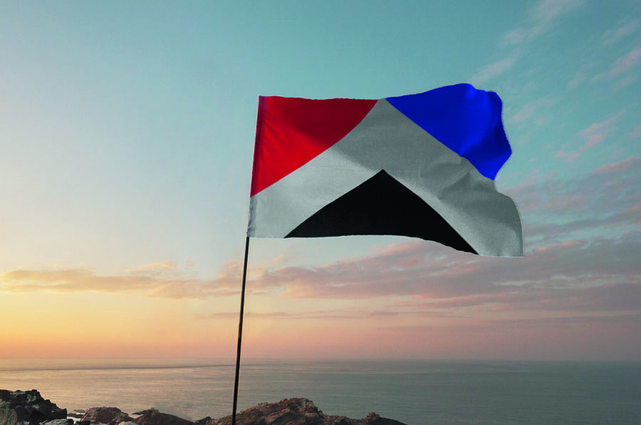
Each triangle of colour fits into each others space. Symbolic of the transition we currently have underway in Aotearoa. Maori/Colonial/Multicultural. Coexisting around the Maihi.( white space between the colours ).The bottom multicultural triangle in our national colour black is symbolic of strength
This flag shows
- Maori who invented their Treaty partners to share the land; The white diagonal shape is representative of the Maihi (the diagonal bargeboards) on the front of a Maori meeting house. The white shape is also symbolic of the coming together of all three influences Maori, Colonial past and multicultural future. The red triangle top left is representative of our Maori heritage. This design also references the use of red, black and white in the Tino Rangatiratanga (National Maori flag)
- The heritage of British settlers. The blue triangle top right is representative of our British heritage. Bordering a white diagonal line symbolic of the Union Jack.
- Our multicultural society – now and into the future. The black triangle is offering up strength and optimism as well as being symbolic of our mountainous landscape. It represents our national colour black already adopted and supported in a multi cultural context.
Summary
Good design should have meaning. Each triangle of colour fits into each others space. Symbolic of the strength of transition we currently have underway in Aotearoa. Maori/Colonial/Future
Good design should acknowledge the past as well as enlighten the future. Our design shows a clear lineage from the Union Jack through the existing flag to now. Red, blue, and white and diagonal shapes are a nod to the past with the introduction of Black our national colour representing our positive multicultural future.
Good design should be simple. Exhibit no superfluous or unnecessary content. It should be edited back to its purest form. Our flag is pure and simple. Less is more. E.g. Canada and Japan
Good design should differentiate. 54 other countries use stars on their flag. Our new flag can better differentiate without stars.