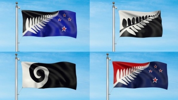
Congratulations to the designers of the 4 flags on the shortlist – it’s great to be getting down to the final stages of the campaign to change the flag. It is clear the consideration panel have tried to find a design that aligns with popular sentiment and that’s really important for getting the required numbers for change. As I’ve said all along, my interpretation of vexillology is that the following are the most important in the choice of a national flag
(a) simplicity
(b) context or in other words the flag must tell a story – it is not a mere logo for recognition
Looking at the 4 preferences I suggest Andrew Fyfe’s design meets the first criterion most closely while either of Kyle Lockwood’s entries can be most closely aligned to who we, the New Zealanders are while actually telling a story that we can pass down to future generations with pride. While the process has come up well short of providing finalists that meet both criteria, as has been pointed out by many other commentators the consideration panel was always destined to be seeking a populist outcome, rather than providing leadership in terms of strong new direction. Having said that they have been emphatic on ditching the Union Jack and we all need to celebrate the jettisoning of the awful colonisation myth.
Kyle hasn’t really provided any strong text to his designs but either of his entries are able to be retrofitted with something meaningful. The Southern Cross in traditional colours is the British influence and has to be recognised. The red is a dominant colour of tino rangatiratanga and should – as per the treaty – be equally identified. And finally we have the logo or motif that all New Zealanders identify with – the silver fern. That can easily be seen to represent our multicultural reality (each of the pinna branching off the fern’s axis representing another or our resident cultures – don’t forget we are one of the most multicultural societies on earth). This is the contemporary New Zealand and of which we can all be proud.
There were stronger stories to tell for sure, and there certainly were simpler designs (who the hell can draw a silver fern?) but in the end this is a process of compromise and both the Lockwood designs at least aren’t reductionist in the extreme giving us either an Affco Meats or Air New Zealand logo as our national flag. And the good news if we choose one of those is that the All Blacks get to keep the silver fern on black as their distinctive motif – everybody should be happy.

